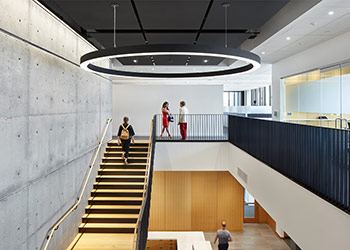
A show-stopping office building in the suburbs. The project amplified the company’s brand identity - strength and integrity - through an honest material palette and a simplified form. The bank’s new headquarters was designed in response to the company’s revitalized brand identity; a sleek and minimalist black and white logo package and a refreshed commitment to sustainability. The building’s location on the site allows for optimal solar orientation, allowing for an infusion of natural light throughout. A weathered zinc shawl floats above an all-glass base, while the interior features a double-height lobby with white oak accents, highlighted by a steel plate stair cantilevered from a velvet, exposed concrete cast-in-place core.
Jury Comments: We really enjoyed the interiors of this project. The refined palette and the material interactions were nicely composed. The contrast between the slick dark materials and the raw concrete highlights both beautifully. The main stair, with its straight ascent along the wall creates a strong back drop to the front entry and desk.

